In this section, we walk through the iterative process of building data visualizations. We start with raw observations, layer on aesthetic mappings and summary geometry, aggregate data to account for repeated measures, and conclude with multi-panel publication figures.
1.1 Step 1: Raw Geometry (The Foundation)
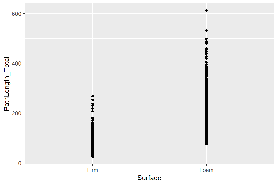
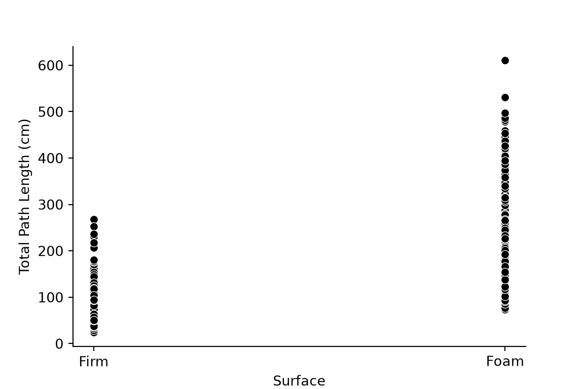
We begin by mapping Surface condition to the x-axis and PathLength_Total to the y-axis. This raw point plot reveals the basic distribution of data but suffers from heavy overplotting across conditions.
It is worth noting that plotnine is a package for Python that uses syntax essentially identical to ggplot in R (both plotnine and ggplot are based on Leland Wilkinson’s “Grammar of Graphics” - a layered system to build data visualizations). However, when making this document using Quarto inside of R Studio, I need to call Python functions using reticulate and - for computing reasons I do not fully understand - it is difficult to render plotnine objects through reticulate. Thus, for these examples, I am using matplotlib and seaborn to great plots similar to my ggplot visualizations, but for pragmatic users, it is probably more efficient to learn ggplot/plotnine syntax that is portable across languages.
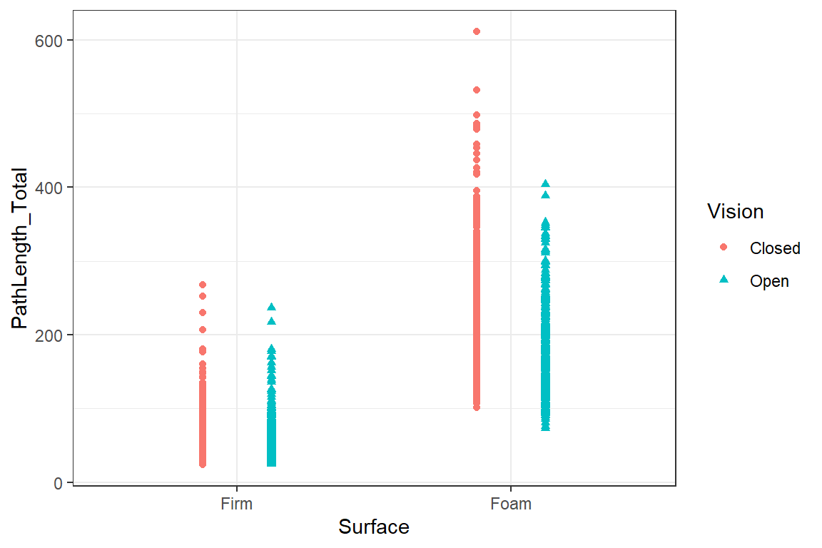
# Plot 2: Dodged points by Vision conditionggplot(data = DATA, aes(x = Surface, y = PathLength_Total)) +geom_point(aes(shape = Vision, col = Vision),position =position_dodge(width =0.5)) +theme_bw()
Show Code
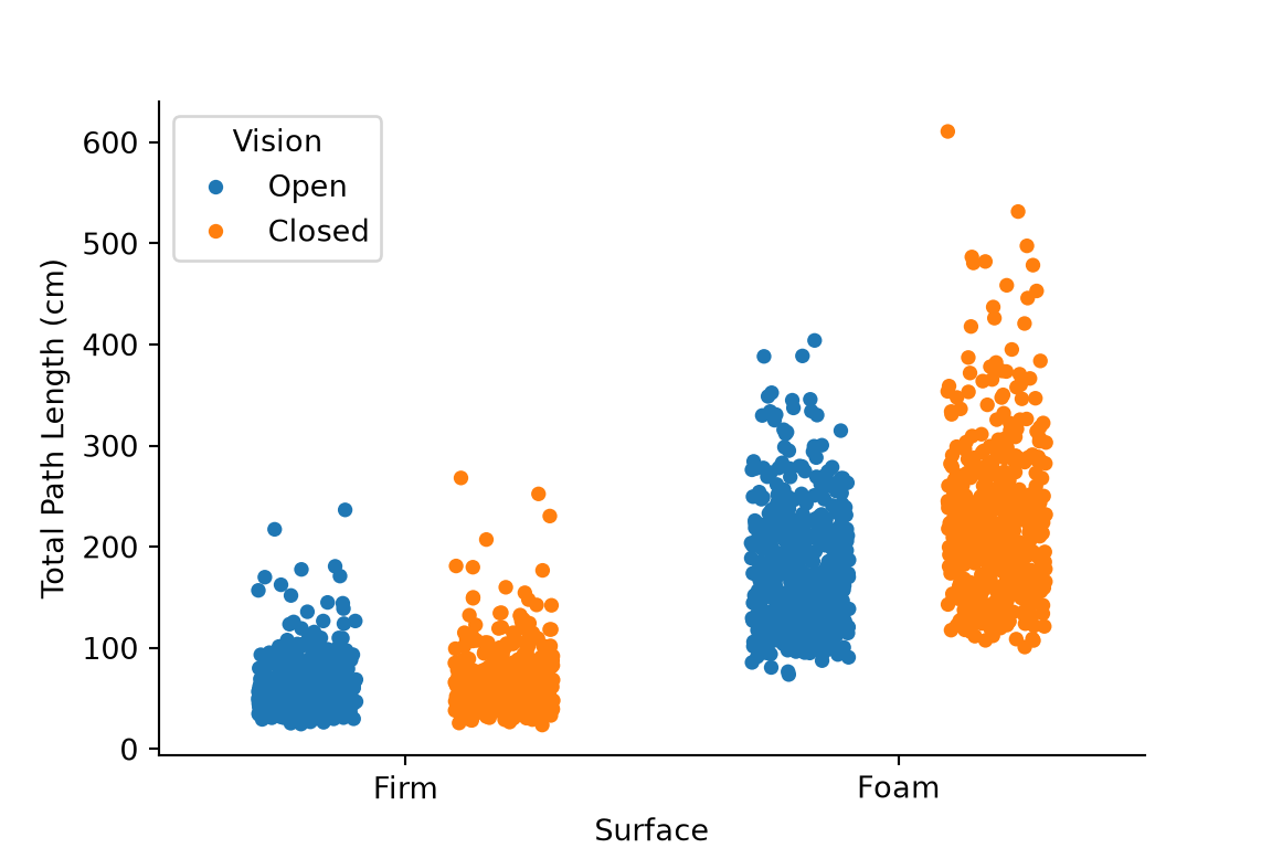
import matplotlib.pyplot as pltimport seaborn as sns# Step 2: Dodged points by Vision conditionfig, ax = plt.subplots(figsize=(6, 4))sns.stripplot( data=DATA, x="Surface", y="PathLength_Total", hue="Vision", dodge=True, jitter=0.2, ax=ax)ax.set_ylabel("Total Path Length (cm)")sns.despine()plt.show()
1.3 Step 3: Layering Jittered Points, Boxplots, and Custom Palettes
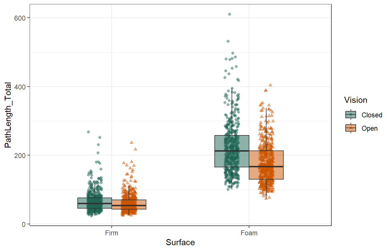
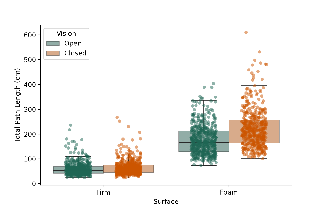
To better summarize central tendency and spread, we overlay boxplots beneath jitter-dodged raw data points and apply a high-contrast, colorblind-friendly palette.
1.4 Step 4: Subject Aggregation and Adding Plot Features
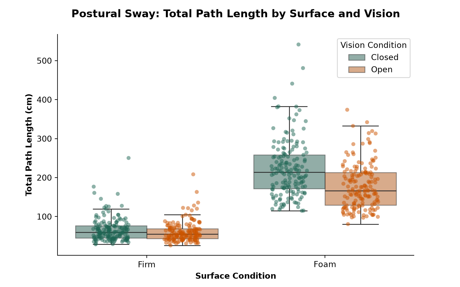
Because individual trials introduce nested variance, we aggregate data to subject-level means (AVE_DATA). We also refine labels, typography, and legend positioning to polish the figure.
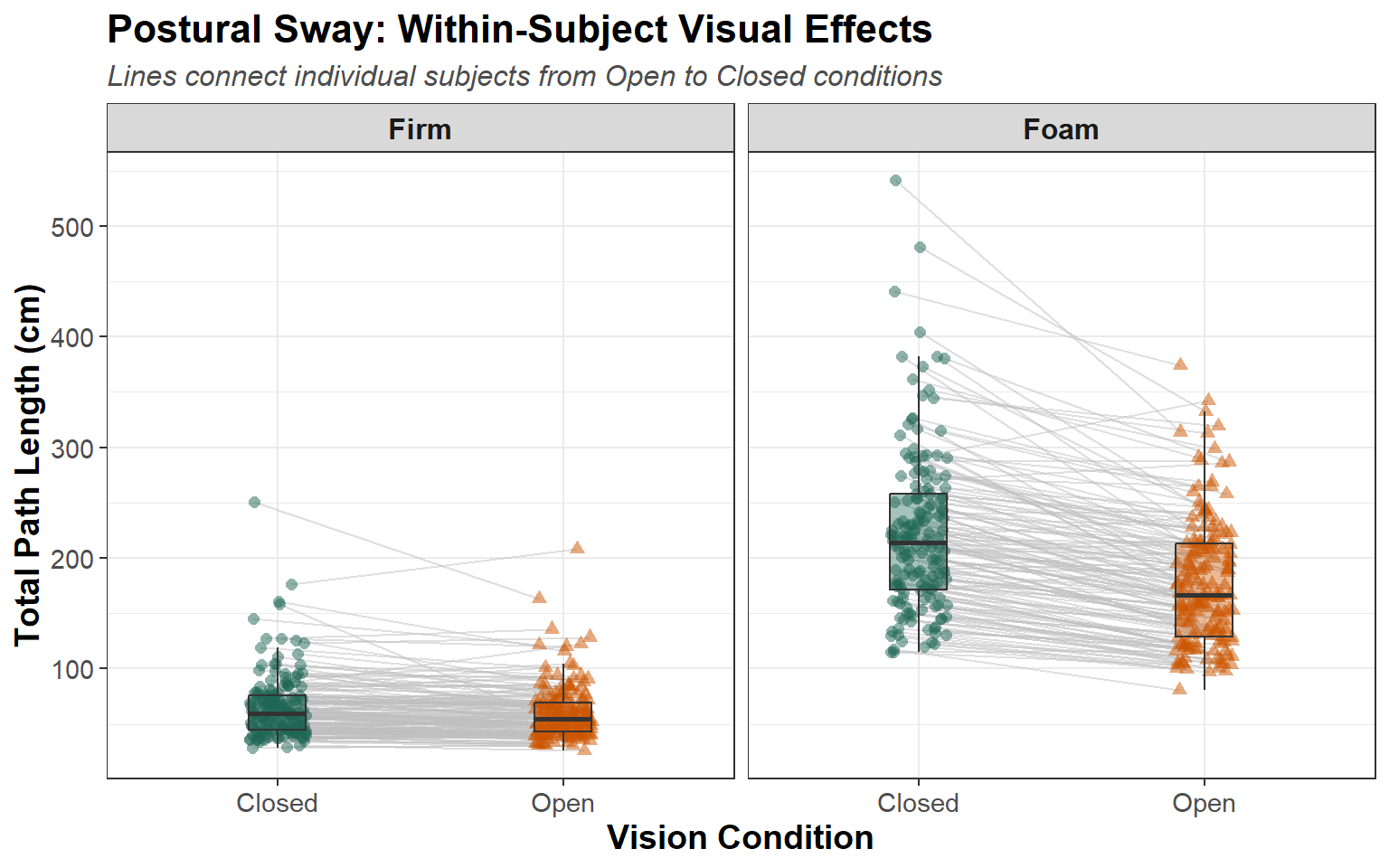
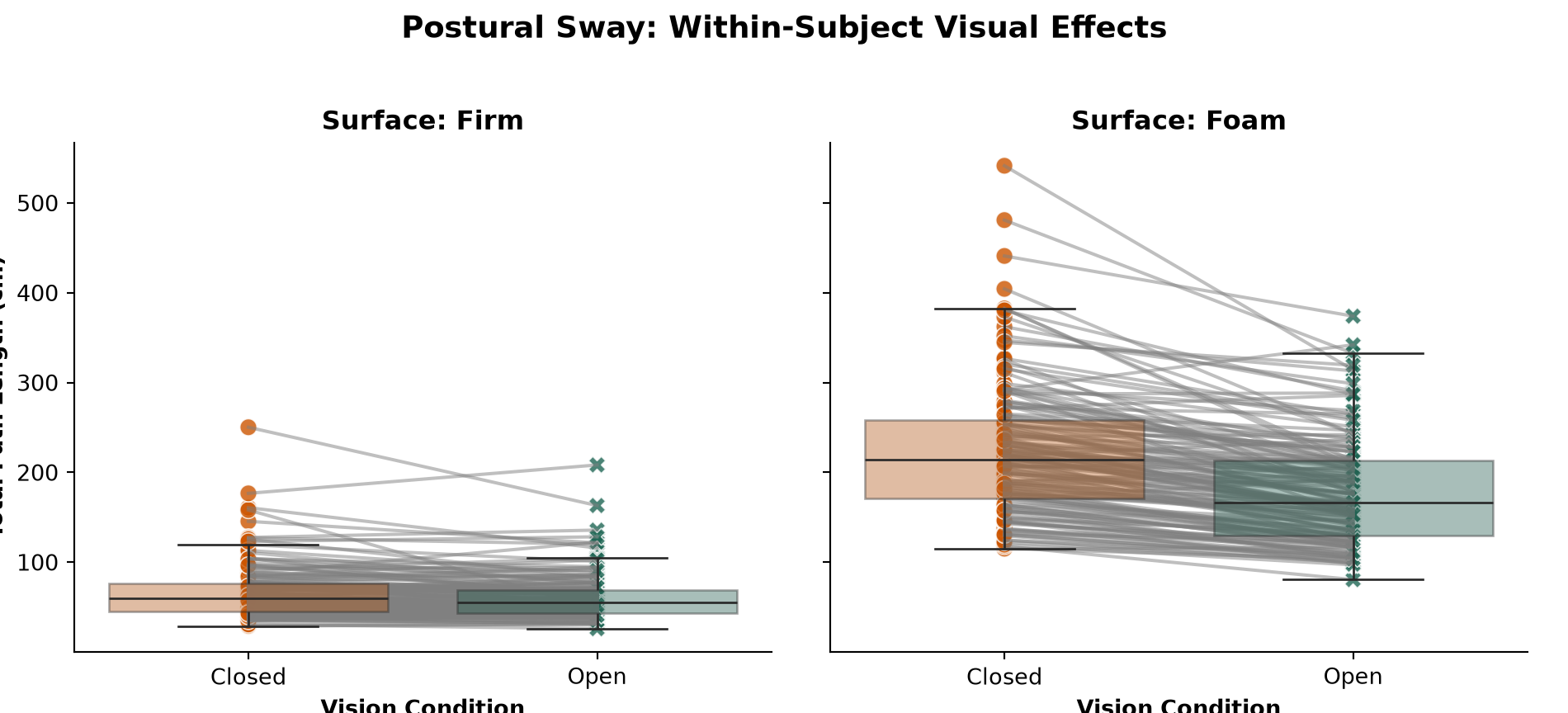
In this study, Surface and Vision are manipulated within a person (i.e., the are both within-subject variables). A critical peace of information in these studies is how consistent participants are in their individal responses (i.e., does the same person tend to score high/low across conditions). Mathematically, we might calculate an intraclass correlation coefficiant to capture how (dis)similar data from the same person happen to be. Visually, we can add lines to our plot “connecting the dots” for data from the same person. To show individual changes across conditions, we facet by Surface and connect subject points from Open to Closed vision conditions using light gray trajectory lines.
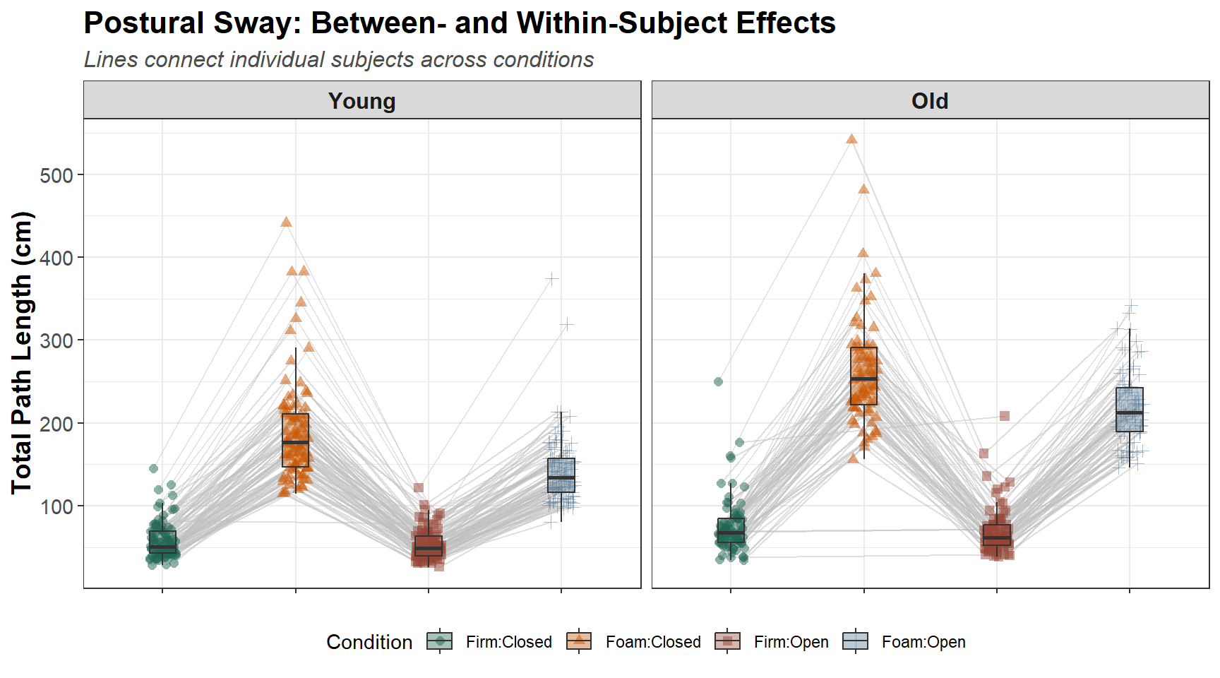
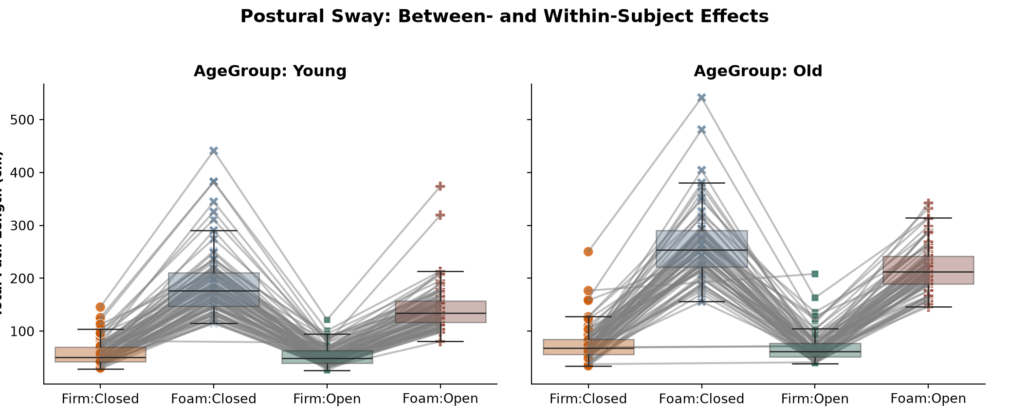
Next, we evaluate how age group interacts with balance conditions. We plot the combined interaction (Surface:Vision) along the x-axis and facet by AgeGroup.
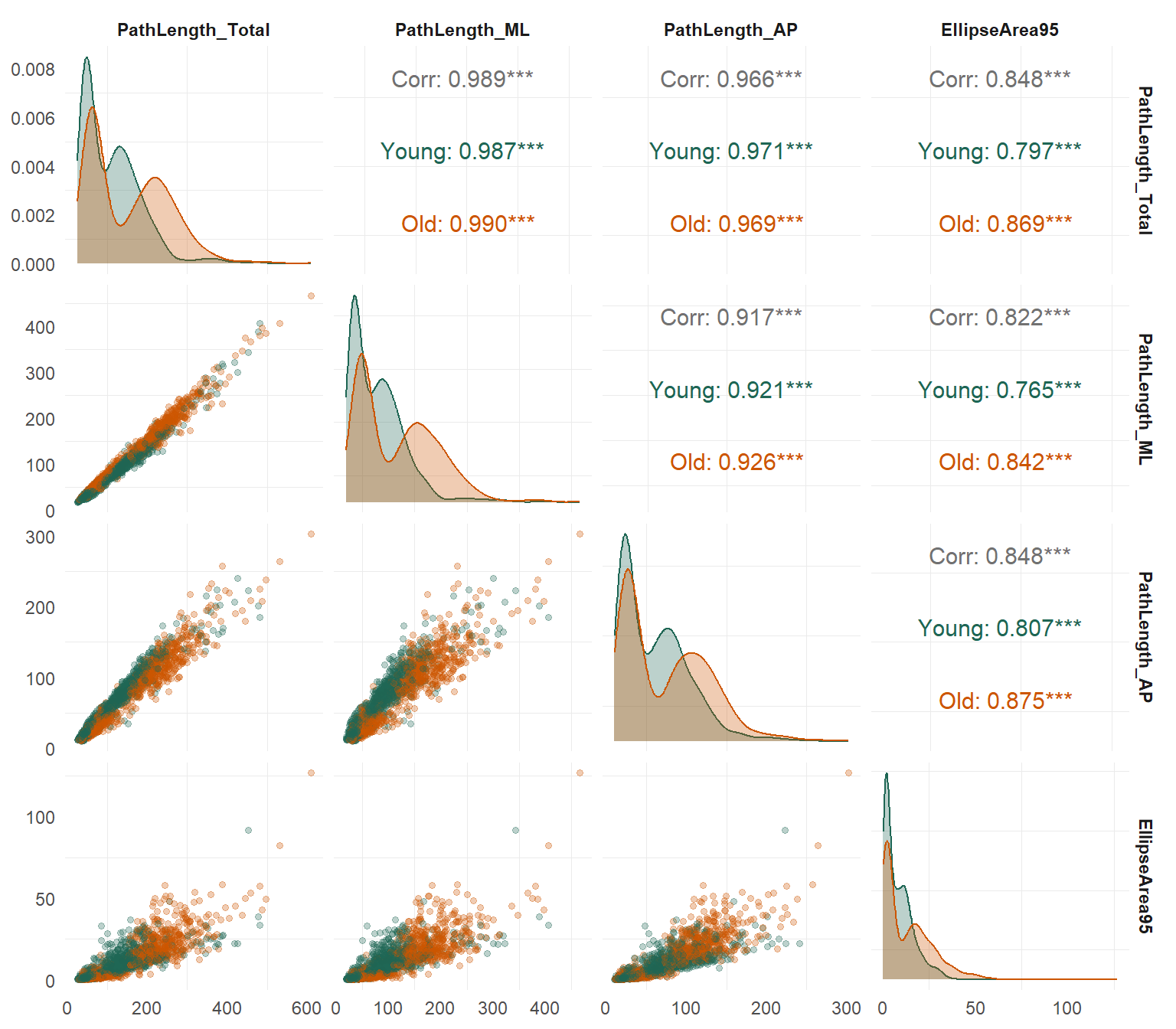
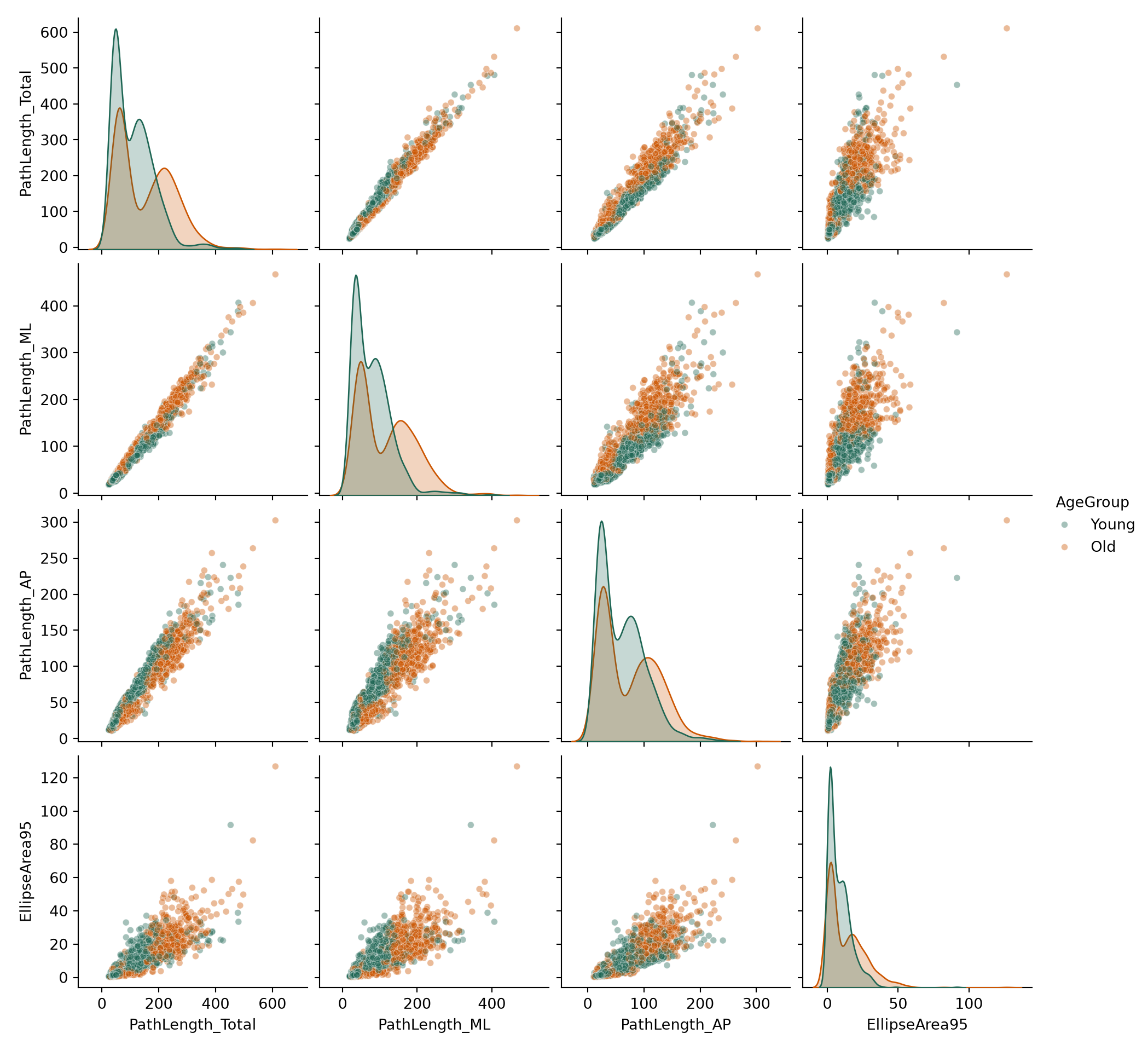
One great feature of programmatic approaches to data visualization is that there are many complex, but relatively common data visualizations that you might want to make. It is often too time consuming to make all of these figures completely from scratch, but fortunately there are many software packages/functions that other people have built that you can readily use. As an example, we will build a multifaceted plot to show the correlations between a set of variables. Visualizing this kind of correlation matrix comes up all the time in data analysis projects - whether you are exploring the data or formally checking mutlicolinearity before building a regression model - so it is a good example to start with here.
To examine all the correlations between our postural metrics across age groups, we build a scatterplot matrix containing bivariate scatter plots comparing each variable to every other variable (lower triangle), density distributions for each variable on its own (diagonal), and correlation coefficients (upper triangle).
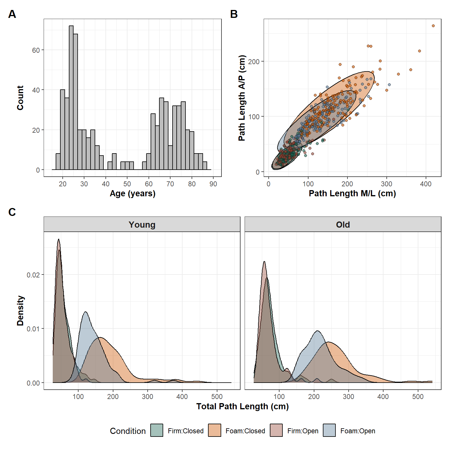
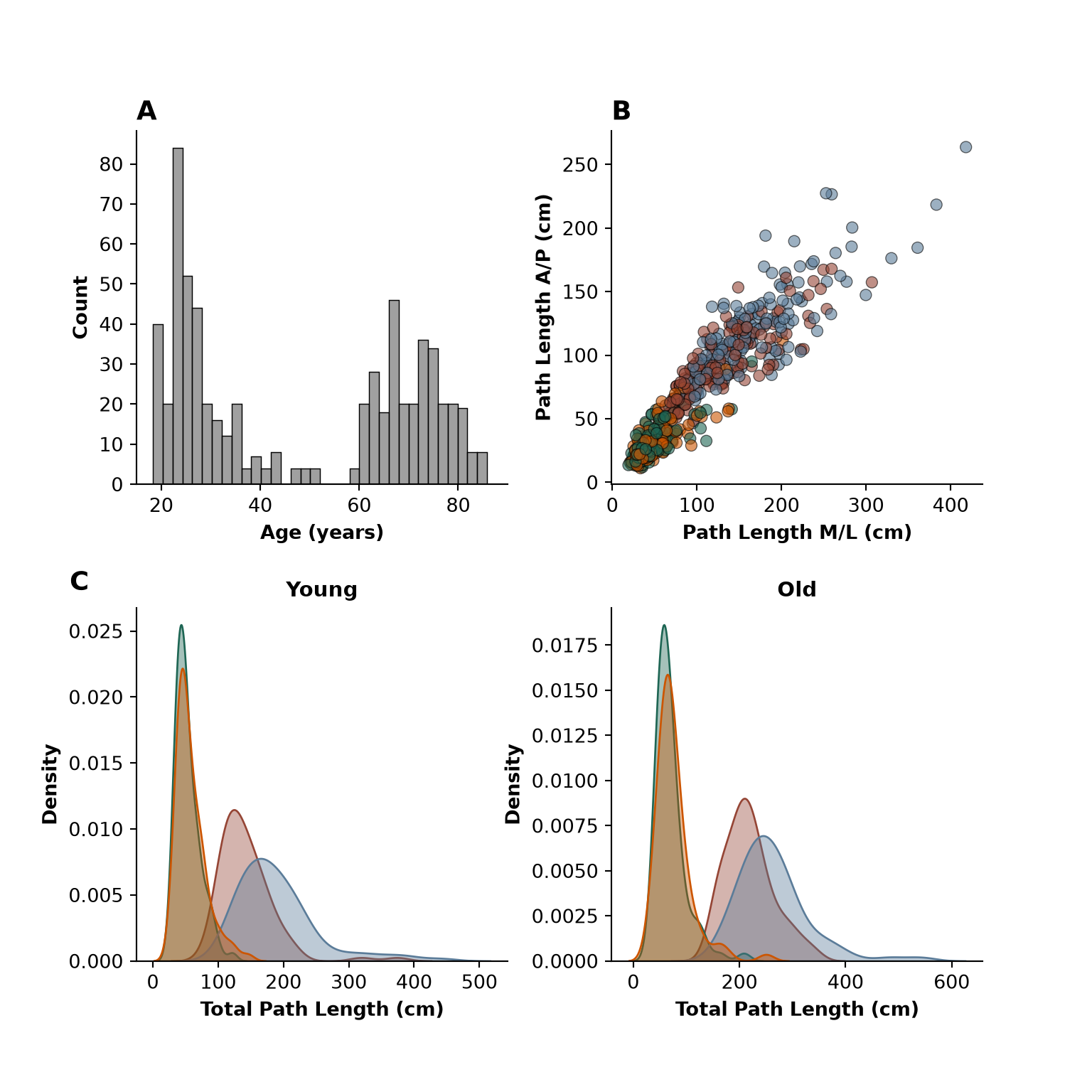
Finally, another common issue that arises in practice is the need to “stitch” multiple panels together into a single figure. People often do this manually using tools like the Gnu Image Manipulation Program or Inkscape (which are open source competitors of tools like Photoshop or Illustrator). It is completely fine to export images into another program to manage/fine tune your layout. However, there are tools in R and Python that allow you to make these kinds of multi-panelled figures. These are great tools to learn because it makes you projects more efficient (e.g., from reading in the data to analysis to final publication-ready figures, you can do it all in one place!).
In the code below, we arrange a few distinct figure types into a multi-panel layout: * Panel A: Age distribution histogram. * Panel B: Directional path length scatter plot (\(\text{PathLength}_{\text{ML}}\) vs \(\text{PathLength}_{\text{AP}}\)) with confidence ellipses. * Panel C: Total path length density distributions by condition faceted across age groups.
# Panel A: Age HistogramFigA <-ggplot(data = AVE_DATA, aes(x = Age)) +geom_histogram(fill ="grey", col ="black", binwidth =2) +scale_x_continuous(limits =c(15, 90), breaks =seq(10, 90, 10)) +theme_bw() +labs(x ="Age (years)", y ="Count") +theme(axis.title =element_text(size =11, face ="bold"))# Panel B: ML vs AP Path Length ScatterFigB <-ggplot(data = AVE_DATA, aes(x = PathLength_ML, y = PathLength_AP)) +stat_ellipse(aes(fill = Condition), geom ="polygon", alpha =0.4, col ="black") +geom_point(aes(fill = Condition), col ="black", shape =21, alpha =0.6) +scale_fill_manual(values = cbPalette) +theme_bw() +labs(x ="Path Length M/L (cm)", y ="Path Length A/P (cm)") +theme(axis.title =element_text(size =11, face ="bold"), legend.position ="none")# Panel C: Density Distributions by ConditionFigC <-ggplot(data = AVE_DATA, aes(x = PathLength_Total)) +geom_density(aes(fill = Condition), alpha =0.4, col ="black") +scale_fill_manual(values = cbPalette) +facet_wrap(~ AgeGroup) +theme_bw() +labs(x ="Total Path Length (cm)", y ="Density") +theme(axis.title =element_text(size =11, face ="bold"),legend.position ="bottom",strip.text =element_text(size =11, face ="bold") )# Combine Panels via Patchwork((FigA + FigB) / FigC) +plot_annotation(tag_levels ='A') &theme(plot.tag =element_text(face ='bold', size =14))
Show Code
import matplotlib.pyplot as pltimport seaborn as snsfig = plt.figure(figsize=(8, 8))gs = fig.add_gridspec(2, 2, height_ratios=[1, 1])# Top Row: Panels A and Bax_a = fig.add_subplot(gs[0, 0])ax_b = fig.add_subplot(gs[0, 1])# Bottom Row: Panel C split by AgeGroup (Young vs Old)ax_c1 = fig.add_subplot(gs[1, 0])ax_c2 = fig.add_subplot(gs[1, 1])cond_colors = {"Firm:Open": cbPalette[0], "Firm:Closed": cbPalette[1],"Foam:Open": cbPalette[2], "Foam:Closed": cbPalette[3]}# Panel A: Age Histogramsns.histplot(data=AVE_DATA, x="Age", binwidth=2, color="gray", edgecolor="black", ax=ax_a)ax_a.set_xlim(15, 90)
(15.0, 90.0)
Show Code
ax_a.set_xlabel("Age (years)", fontweight="bold")ax_a.set_ylabel("Count", fontweight="bold")ax_a.set_title("A", loc="left", fontweight="bold", fontsize=14)# Panel B: ML vs AP Path Length Scattersns.scatterplot( data=AVE_DATA, x="PathLength_ML", y="PathLength_AP", hue="Condition", palette=cond_colors, alpha=0.6, edgecolor="black", ax=ax_b)ax_b.set_xlabel("Path Length M/L (cm)", fontweight="bold")ax_b.set_ylabel("Path Length A/P (cm)", fontweight="bold")ax_b.get_legend().remove()ax_b.set_title("B", loc="left", fontweight="bold", fontsize=14)# Panel C1: Density Distribution - Young Adultssns.kdeplot( data=AVE_DATA[AVE_DATA["AgeGroup"] =="Young"], x="PathLength_Total", hue="Condition", palette=cond_colors, fill=True, common_norm=False, alpha=0.4, ax=ax_c1, legend=False)ax_c1.set_xlabel("Total Path Length (cm)", fontweight="bold")ax_c1.set_ylabel("Density", fontweight="bold")ax_c1.set_title("Young", fontweight="bold", fontsize=11)# Add "C" tag to the left density subplotax_c1.text(-0.18, 1.05, "C", transform=ax_c1.transAxes, fontweight="bold", fontsize=14)# Panel C2: Density Distribution - Older Adultssns.kdeplot( data=AVE_DATA[AVE_DATA["AgeGroup"] =="Old"], x="PathLength_Total", hue="Condition", palette=cond_colors, fill=True, common_norm=False, alpha=0.4, ax=ax_c2)ax_c2.set_xlabel("Total Path Length (cm)", fontweight="bold")ax_c2.set_ylabel("Density", fontweight="bold")ax_c2.set_title("Old", fontweight="bold", fontsize=11)# Extract legend handles from ax_c2 and create a clean shared figure legendhandles, labels = ax_c2.get_legend_handles_labels()ax_c2.get_legend().remove()fig.legend( handles, labels, loc="lower center", bbox_to_anchor=(0.5, -0.01), ncol=4, frameon=False)sns.despine()plt.subplots_adjust(bottom=0.12, hspace=0.35, wspace=0.28)plt.show()
Source Code
---title: "Static Data Visualization"subtitle: "A Parallel Guide in R and Python"---# Static Data VisualizationIn this section, we walk through the iterative process of building data visualizations. We start with raw observations, layer on aesthetic mappings and summary geometry, aggregate data to account for repeated measures, and conclude with multi-panel publication figures.---## Step 1: Raw Geometry (The Foundation)We begin by mapping `Surface` condition to the x-axis and `PathLength_Total` to the y-axis. This raw point plot reveals the basic distribution of data but suffers from heavy overplotting across conditions.It is worth noting that `plotnine` is a package for Python that uses syntax essentially identical to `ggplot` in R (both `plotnine` and `ggplot` are based on Leland Wilkinson’s "Grammar of Graphics" - a layered system to build data visualizations). However, when making this document using *Quarto* inside of *R Studio*, I need to call Python functions using `reticulate` and - for computing reasons I do not fully understand - it is difficult to render `plotnine` objects through `reticulate`. Thus, for these examples, I am using `matplotlib` and `seaborn` to great plots similar to my `ggplot` visualizations, but for pragmatic users, it is probably more efficient to learn `ggplot`/`plotnine` syntax that is portable across languages.::: {.panel-tabset}## R (`ggplot2`)```{r}#| label: script02-r-plot1#| fig-width: 6#| fig-height: 4library(tidyverse)library(patchwork)library(GGally)DATA <-readRDS("./data/BDS/output/BDS_trial_summary.rds") %>%mutate(Subject =factor(Subject),AgeGroup =fct_relevel(AgeGroup, "Young", "Old"))# Plot 1: Basic scatter plotggplot(data = DATA, aes(x = Surface, y = PathLength_Total)) +geom_point()```## Python (`matplotlib` & `seaborn`)```{python}#| label: script02-py-plot1#| fig-width: 6#| fig-height: 4import pandas as pdimport matplotlib.pyplot as pltimport seaborn as snsDATA = pd.read_csv("./data/BDS/output/BDS_trial_summary.csv")DATA["AgeGroup"] = pd.Categorical(DATA["AgeGroup"], categories=["Young", "Old"], ordered=True)# Step 1: Basic scatter plotfig, ax = plt.subplots(figsize=(6, 4))sns.scatterplot(data=DATA, x="Surface", y="PathLength_Total", color="black", ax=ax)ax.set_ylabel("Total Path Length (cm)")sns.despine()plt.show()```:::---## Step 2: Adding Aesthetic MappingsTo evaluate the effect of visual input, we map `Vision` to point shape and color while dodging the points along the x-axis to reduce overlap.::: {.panel-tabset}## R (`ggplot2`)```{r}#| label: script02-r-plot2#| fig-width: 6#| fig-height: 4# Plot 2: Dodged points by Vision conditionggplot(data = DATA, aes(x = Surface, y = PathLength_Total)) +geom_point(aes(shape = Vision, col = Vision),position =position_dodge(width =0.5)) +theme_bw()```## Python (`matplotlib` & `seaborn`)```{python}#| label: script02-py-plot2#| fig-width: 6#| fig-height: 4import matplotlib.pyplot as pltimport seaborn as sns# Step 2: Dodged points by Vision conditionfig, ax = plt.subplots(figsize=(6, 4))sns.stripplot( data=DATA, x="Surface", y="PathLength_Total", hue="Vision", dodge=True, jitter=0.2, ax=ax)ax.set_ylabel("Total Path Length (cm)")sns.despine()plt.show()```:::---## Step 3: Layering Jittered Points, Boxplots, and Custom PalettesTo better summarize central tendency and spread, we overlay boxplots beneath jitter-dodged raw data points and apply a high-contrast, colorblind-friendly palette.::: {.panel-tabset}## R (`ggplot2`)```{r}#| label: script02-r-plot3#| fig-width: 7#| fig-height: 4.5cbPalette <-c("#1E6654", "#CC5500", "#954535", "#5B7C99","#8366BD", "#D1C071", "#F0EAD6", "grey20")# Plot 3: Boxplots with jitter-dodged pointsggplot(data = DATA, aes(x = Surface, y = PathLength_Total)) +geom_point(aes(shape = Vision, col = Vision),position =position_jitterdodge(dodge.width =0.5, jitter.width =0.2),alpha =0.5) +geom_boxplot(aes(fill = Vision), width =0.5,position =position_dodge(width =0.5),alpha =0.5, outlier.shape =NA) +scale_color_manual(values = cbPalette[c(1,2)]) +scale_fill_manual(values = cbPalette[c(1,2)]) +theme_bw()```## Python (`matplotlib` & `seaborn`)```{python}#| label: script02-py-plot3#| fig-width: 7#| fig-height: 4.5cbPalette = ["#1E6654", "#CC5500", "#954535", "#5B7C99", "#8366BD", "#D1C071", "#F0EAD6", "#333333"]# Step 3: Boxplots with jitter-dodged pointsfig, ax = plt.subplots(figsize=(7, 4.5))sns.boxplot( data=DATA, x="Surface", y="PathLength_Total", hue="Vision", palette=cbPalette[:2], boxprops=dict(alpha=0.5), showfliers=False, ax=ax)sns.stripplot( data=DATA, x="Surface", y="PathLength_Total", hue="Vision", dodge=True, jitter=0.2, palette=cbPalette[:2], alpha=0.5, ax=ax)# Deduplicate legend entrieshandles, labels = ax.get_legend_handles_labels()ax.legend(handles[:2], labels[:2], title="Vision")ax.set_ylabel("Total Path Length (cm)")sns.despine()plt.show()```:::---## Step 4: Subject Aggregation and Adding Plot FeaturesBecause individual trials introduce nested variance, we aggregate data to subject-level means (`AVE_DATA`). We also refine labels, typography, and legend positioning to polish the figure.::: {.panel-tabset}## R (`ggplot2`)```{r}#| label: script02-r-plot4#| fig-width: 8#| fig-height: 5# Aggregate trial data to subject-level averagesAVE_DATA <- DATA %>%select(-Trial) %>%group_by(Subject, Vision, Surface) %>%summarise(across(where(is.numeric), ~mean(.x, na.rm =TRUE)),across(!where(is.numeric), dplyr::first),.groups ="drop" )# Plot 4: Formatted subject-level summaryggplot(data = AVE_DATA, aes(x = Surface, y = PathLength_Total)) +geom_point(aes(shape = Vision, col = Vision),position =position_jitterdodge(dodge.width =0.5, jitter.width =0.2),alpha =0.5) +geom_boxplot(aes(fill = Vision), width =0.5,position =position_dodge(width =0.5),alpha =0.5, outlier.shape =NA) +scale_color_manual(values = cbPalette[c(1,2)]) +scale_fill_manual(values = cbPalette[c(1,2)]) +theme_bw() +labs(title ="Postural Sway: Total Path Length by Surface and Vision",subtitle ="Mean values aggregated across trials per subject",x ="Surface Condition",y ="Total Path Length (cm)",shape ="Vision Condition", col ="Vision Condition",fill ="Vision Condition" ) +theme(axis.title =element_text(size =12, face ="bold"),axis.text =element_text(size =11),legend.position ="bottom",plot.title =element_text(size =14, face ="bold"),plot.subtitle =element_text(size =12, face ="italic", color ="gray30") )```## Python (`matplotlib` & `seaborn`)```{python}#| label: script02-py-plot4#| fig-width: 8#| fig-height: 5AVE_DATA = DATA.groupby(["Subject", "Vision", "Surface", "AgeGroup"], as_index=False).mean(numeric_only=True)# Step 4: Formatted subject-level summaryfig, ax = plt.subplots(figsize=(8, 5))sns.boxplot( data=AVE_DATA, x="Surface", y="PathLength_Total", hue="Vision", palette=cbPalette[:2], boxprops=dict(alpha=0.5), showfliers=False, ax=ax)sns.stripplot( data=AVE_DATA, x="Surface", y="PathLength_Total", hue="Vision", dodge=True, jitter=0.2, palette=cbPalette[:2], alpha=0.5, ax=ax)handles, labels = ax.get_legend_handles_labels()ax.legend(handles[:2], labels[:2], title="Vision Condition", loc="upper right")ax.set_title("Postural Sway: Total Path Length by Surface and Vision\n", fontweight="bold", fontsize=13)ax.set_xlabel("Surface Condition", fontweight="bold")ax.set_ylabel("Total Path Length (cm)", fontweight="bold")sns.despine()plt.show()```:::---## Step 5: Visualizing Within-Subject TrajectoriesIn this study, `Surface` and `Vision` are manipulated within a person (i.e., the are both within-subject variables). A critical peace of information in these studies is how consistent participants are in their individal responses (i.e., does the same person tend to score high/low across conditions). Mathematically, we might calculate an intraclass correlation coefficiant to capture how (dis)similar data from the same person happen to be. Visually, we can add lines to our plot "connecting the dots" for data from the same person. To show individual changes across conditions, we facet by `Surface` and connect subject points from `Open` to `Closed` vision conditions using light gray trajectory lines.::: {.panel-tabset}## R (`ggplot2`)```{r}#| label: script02-r-plot5#| fig-width: 8#| fig-height: 5# Plot 5: Within-subject lines faceted by Surfaceggplot(data = AVE_DATA, aes(x = Vision, y = PathLength_Total)) +geom_line(aes(group = Subject), color ="gray75", alpha =0.5, linewidth =0.5,position =position_dodge(width =0.2)) +geom_point(aes(group = Subject, shape = Vision, col = Vision), size =2, alpha =0.5,position =position_dodge(width =0.2)) +geom_boxplot(aes(fill = Vision), width =0.2, alpha =0.4, outlier.shape =NA) +facet_wrap(~ Surface) +scale_color_manual(values = cbPalette[c(1,2)]) +scale_fill_manual(values = cbPalette[c(1,2)]) +theme_bw() +labs(title ="Postural Sway: Within-Subject Visual Effects",subtitle ="Lines connect individual subjects from Open to Closed conditions",x ="Vision Condition",y ="Total Path Length (cm)" ) +theme(plot.title =element_text(size =16, face ="bold"),plot.subtitle =element_text(size =12, face ="italic", color ="gray30"),axis.title =element_text(size =14, face ="bold"),axis.text =element_text(size =11),legend.position ="none",strip.text =element_text(size =12, face ="bold") )```## Python (`matplotlib` & `seaborn`)```{python}#| label: script02-py-plot5#| fig-width: 8#| fig-height: 5# Step 5: Within-subject trajectory lines faceted by Surfacevis_palette = {"Open": cbPalette[0], "Closed": cbPalette[1]}g = sns.FacetGrid(AVE_DATA, col="Surface", height=4.5, aspect=1.1)for surf_name, ax in g.axes_dict.items(): sub = AVE_DATA[AVE_DATA["Surface"] == surf_name]# Layer 1: Subject lines sns.lineplot( data=sub, x="Vision", y="PathLength_Total", units="Subject", estimator=None, color="gray", alpha=0.5, ax=ax )# Layer 2: Overlay scatter points sns.scatterplot( data=sub, x="Vision", y="PathLength_Total", hue="Vision", style="Vision", palette=vis_palette, s=60, alpha=0.8, legend=False, ax=ax )# Layer 3: Boxplot sns.boxplot( data=sub, x="Vision", y="PathLength_Total", palette=vis_palette, boxprops=dict(alpha=0.4), showfliers=False, ax=ax ) ax.set_title(f"Surface: {surf_name}", fontweight="bold") ax.set_xlabel("Vision Condition", fontweight="bold") ax.set_ylabel("Total Path Length (cm)", fontweight="bold")g.fig.subplots_adjust(top=0.8)g.fig.suptitle("Postural Sway: Within-Subject Visual Effects", fontweight="bold", fontsize=14)sns.despine()plt.show()```:::---## Step 6: Incorporating Between-Subject Factors (`AgeGroup`)Next, we evaluate how age group interacts with balance conditions. We plot the combined interaction (`Surface:Vision`) along the x-axis and facet by `AgeGroup`.::: {.panel-tabset}## R (`ggplot2`)```{r}#| label: script02-r-plot6#| fig-width: 9#| fig-height: 5# Create interaction factor for clean aesthetic mappingAVE_DATA <- AVE_DATA %>%mutate(Condition =interaction(Surface, Vision, sep =":"))# Plot 6: Interaction conditions faceted by AgeGroupggplot(data = AVE_DATA, aes(x = Condition, y = PathLength_Total)) +geom_line(aes(group = Subject), color ="gray75", alpha =0.5, linewidth =0.5,position =position_dodge(width =0.2)) +geom_point(aes(shape = Condition, col = Condition, group = Subject), size =2, alpha =0.5, position =position_dodge(width =0.2)) +geom_boxplot(aes(fill = Condition), width =0.2, alpha =0.4, outlier.shape =NA) +facet_wrap(~ AgeGroup) +scale_color_manual(values = cbPalette) +scale_fill_manual(values = cbPalette) +theme_bw() +labs(title ="Postural Sway: Between- and Within-Subject Effects",subtitle ="Lines connect individual subjects across conditions",x =NULL,y ="Total Path Length (cm)",shape ="Condition", col ="Condition", fill ="Condition" ) +theme(plot.title =element_text(size =16, face ="bold"),plot.subtitle =element_text(size =12, face ="italic", color ="gray30"),axis.title =element_text(size =14, face ="bold"),axis.text.x =element_blank(),axis.text.y =element_text(size =11),legend.position ="bottom",strip.text =element_text(size =12, face ="bold") )```## Python (`matplotlib` & `seaborn`)```{python}#| label: script02-py-plot6#| fig-width: 9#| fig-height: 5AVE_DATA["Condition"] = AVE_DATA["Surface"].astype(str) +":"+ AVE_DATA["Vision"].astype(str)cond_order = ["Firm:Open", "Firm:Closed", "Foam:Open", "Foam:Closed"]cond_palette = {cond: cbPalette[i] for i, cond inenumerate(cond_order)}g = sns.FacetGrid(AVE_DATA, col="AgeGroup", height=4.5, aspect=1.2)for age_group, ax in g.axes_dict.items(): sub = AVE_DATA[AVE_DATA["AgeGroup"] == age_group]# Layer 1: Subject lines sns.lineplot( data=sub, x="Condition", y="PathLength_Total", units="Subject", estimator=None, color="gray", alpha=0.5, ax=ax )# Layer 2: Overlay scatter points sns.scatterplot( data=sub, x="Condition", y="PathLength_Total", hue="Condition", style="Condition", palette=cond_palette, s=60, alpha=0.8, legend=False, ax=ax )# Layer 3: Boxplot sns.boxplot( data=sub, x="Condition", y="PathLength_Total", order=cond_order, palette=cond_palette, boxprops=dict(alpha=0.4), showfliers=False, ax=ax ) ax.set_title(f"AgeGroup: {age_group}", fontweight="bold") ax.set_xlabel("") ax.set_ylabel("Total Path Length (cm)", fontweight="bold")g.fig.subplots_adjust(top=0.8)g.fig.suptitle("Postural Sway: Between- and Within-Subject Effects", fontweight="bold", fontsize=14)sns.despine()plt.show()```:::---## Step 7: Multivariate Correlation MatrixOne great feature of programmatic approaches to data visualization is that there are many complex, but relatively common data visualizations that you might want to make. It is often too time consuming to make all of these figures completely from scratch, but fortunately there are many software packages/functions that other people have built that you can readily use. As an example, we will build a multifaceted plot to show the correlations between a set of variables. Visualizing this kind of correlation matrix comes up all the time in data analysis projects - whether you are exploring the data or formally checking mutlicolinearity before building a regression model - so it is a good example to start with here. To examine all the correlations between our postural metrics across age groups, we build a scatterplot matrix containing bivariate scatter plots comparing each variable to every other variable (lower triangle), density distributions for each variable on its own (diagonal), and correlation coefficients (upper triangle).::: {.panel-tabset}## R (`GGally`)```{r}#| label: script02-r-plot7#| fig-width: 8#| fig-height: 7plot_data <- DATA %>%select(AgeGroup, PathLength_Total, PathLength_ML, PathLength_AP, EllipseArea95) # Plot 7: Correlogram matrixggpairs(data = plot_data,columns =2:5,mapping =aes(color = AgeGroup, fill = AgeGroup),lower =list(continuous =wrap("points", alpha =0.3, size =1.2)),diag =list(continuous =wrap("densityDiag", alpha =0.3)),upper =list(continuous =wrap("cor", size =4))) +theme_minimal() +scale_fill_manual(values = cbPalette) +scale_color_manual(values = cbPalette) +theme(panel.grid.major =element_blank(),strip.text =element_text(face ="bold") )```## Python (`seaborn`)```{python}#| label: script02-py-plot7#| fig-width: 8#| fig-height: 7import seaborn as snsimport matplotlib.pyplot as pltplot_vars = ["PathLength_Total", "PathLength_ML", "PathLength_AP", "EllipseArea95", "AgeGroup"]plot_data = DATA[plot_vars]# Plot 7: Seaborn pairplot matrixg = sns.pairplot( plot_data,vars=["PathLength_Total", "PathLength_ML", "PathLength_AP", "EllipseArea95"], hue="AgeGroup", palette={"Young": cbPalette[0], "Old": cbPalette[1]}, diag_kind="kde", plot_kws={"alpha": 0.4, "s": 20})g.fig.suptitle("Multivariate Correlation Matrix by Age Group", y=1.02, fontweight="bold")plt.show()```:::---## Step 8: Multi-Panel Publication Composite LayoutFinally, another common issue that arises in practice is the need to "stitch" multiple panels together into a single figure. People often do this manually using tools like the [Gnu Image Manipulation Program](https://www.gimp.org/) or [Inkscape](https://inkscape.org/) (which are open source competitors of tools like [Photoshop or Illustrator](https://www.adobe.com)). It is completely fine to export images into another program to manage/fine tune your layout. However, there are tools in `R` and `Python` that allow you to make these kinds of multi-panelled figures. These are great tools to learn because it makes you projects more efficient (e.g., from reading in the data to analysis to final publication-ready figures, you can do it all in one place!). In the code below, we arrange a few distinct figure types into a multi-panel layout:* **Panel A**: Age distribution histogram.* **Panel B**: Directional path length scatter plot ($\text{PathLength}_{\text{ML}}$ vs $\text{PathLength}_{\text{AP}}$) with confidence ellipses.* **Panel C**: Total path length density distributions by condition faceted across age groups.::: {.panel-tabset}## R (`patchwork`)```{r}#| label: script02-r-plot8#| fig-width: 8#| fig-height: 8# Panel A: Age HistogramFigA <-ggplot(data = AVE_DATA, aes(x = Age)) +geom_histogram(fill ="grey", col ="black", binwidth =2) +scale_x_continuous(limits =c(15, 90), breaks =seq(10, 90, 10)) +theme_bw() +labs(x ="Age (years)", y ="Count") +theme(axis.title =element_text(size =11, face ="bold"))# Panel B: ML vs AP Path Length ScatterFigB <-ggplot(data = AVE_DATA, aes(x = PathLength_ML, y = PathLength_AP)) +stat_ellipse(aes(fill = Condition), geom ="polygon", alpha =0.4, col ="black") +geom_point(aes(fill = Condition), col ="black", shape =21, alpha =0.6) +scale_fill_manual(values = cbPalette) +theme_bw() +labs(x ="Path Length M/L (cm)", y ="Path Length A/P (cm)") +theme(axis.title =element_text(size =11, face ="bold"), legend.position ="none")# Panel C: Density Distributions by ConditionFigC <-ggplot(data = AVE_DATA, aes(x = PathLength_Total)) +geom_density(aes(fill = Condition), alpha =0.4, col ="black") +scale_fill_manual(values = cbPalette) +facet_wrap(~ AgeGroup) +theme_bw() +labs(x ="Total Path Length (cm)", y ="Density") +theme(axis.title =element_text(size =11, face ="bold"),legend.position ="bottom",strip.text =element_text(size =11, face ="bold") )# Combine Panels via Patchwork((FigA + FigB) / FigC) +plot_annotation(tag_levels ='A') &theme(plot.tag =element_text(face ='bold', size =14))```## Python (`matplotlib` & `seaborn`)```{python}#| label: script02-py-plot8#| fig-width: 8#| fig-height: 8import matplotlib.pyplot as pltimport seaborn as snsfig = plt.figure(figsize=(8, 8))gs = fig.add_gridspec(2, 2, height_ratios=[1, 1])# Top Row: Panels A and Bax_a = fig.add_subplot(gs[0, 0])ax_b = fig.add_subplot(gs[0, 1])# Bottom Row: Panel C split by AgeGroup (Young vs Old)ax_c1 = fig.add_subplot(gs[1, 0])ax_c2 = fig.add_subplot(gs[1, 1])cond_colors = {"Firm:Open": cbPalette[0], "Firm:Closed": cbPalette[1],"Foam:Open": cbPalette[2], "Foam:Closed": cbPalette[3]}# Panel A: Age Histogramsns.histplot(data=AVE_DATA, x="Age", binwidth=2, color="gray", edgecolor="black", ax=ax_a)ax_a.set_xlim(15, 90)ax_a.set_xlabel("Age (years)", fontweight="bold")ax_a.set_ylabel("Count", fontweight="bold")ax_a.set_title("A", loc="left", fontweight="bold", fontsize=14)# Panel B: ML vs AP Path Length Scattersns.scatterplot( data=AVE_DATA, x="PathLength_ML", y="PathLength_AP", hue="Condition", palette=cond_colors, alpha=0.6, edgecolor="black", ax=ax_b)ax_b.set_xlabel("Path Length M/L (cm)", fontweight="bold")ax_b.set_ylabel("Path Length A/P (cm)", fontweight="bold")ax_b.get_legend().remove()ax_b.set_title("B", loc="left", fontweight="bold", fontsize=14)# Panel C1: Density Distribution - Young Adultssns.kdeplot( data=AVE_DATA[AVE_DATA["AgeGroup"] =="Young"], x="PathLength_Total", hue="Condition", palette=cond_colors, fill=True, common_norm=False, alpha=0.4, ax=ax_c1, legend=False)ax_c1.set_xlabel("Total Path Length (cm)", fontweight="bold")ax_c1.set_ylabel("Density", fontweight="bold")ax_c1.set_title("Young", fontweight="bold", fontsize=11)# Add "C" tag to the left density subplotax_c1.text(-0.18, 1.05, "C", transform=ax_c1.transAxes, fontweight="bold", fontsize=14)# Panel C2: Density Distribution - Older Adultssns.kdeplot( data=AVE_DATA[AVE_DATA["AgeGroup"] =="Old"], x="PathLength_Total", hue="Condition", palette=cond_colors, fill=True, common_norm=False, alpha=0.4, ax=ax_c2)ax_c2.set_xlabel("Total Path Length (cm)", fontweight="bold")ax_c2.set_ylabel("Density", fontweight="bold")ax_c2.set_title("Old", fontweight="bold", fontsize=11)# Extract legend handles from ax_c2 and create a clean shared figure legendhandles, labels = ax_c2.get_legend_handles_labels()ax_c2.get_legend().remove()fig.legend( handles, labels, loc="lower center", bbox_to_anchor=(0.5, -0.01), ncol=4, frameon=False)sns.despine()plt.subplots_adjust(bottom=0.12, hspace=0.35, wspace=0.28)plt.show()```:::